Reco
Brand Description
Reco secures AI agents and their operating environments where applications, identities, permissions, and workflows intersect. Every agent your business deploys enters a growing ecosystem it can expand autonomously. Reco maps that ecosystem, reveals what agents can reach, and detects when something deviates from policy before it becomes a liability.
About the Project.
When I first came across Reco, I was genuinely fascinated by its vision. As enterprises adopt more AI agents, manually monitoring their access, permissions, and security becomes increasingly difficult. Reco solves this by acting as a central "super agent" that governs and secures all AI agents across an organization.
I felt such an innovative concept deserved visuals that were simple, engaging, and easy for anyone to understand. That inspired me to take on this project and translate Reco's vision into a clear visual story.


Leveraging AI for Script & VO Development
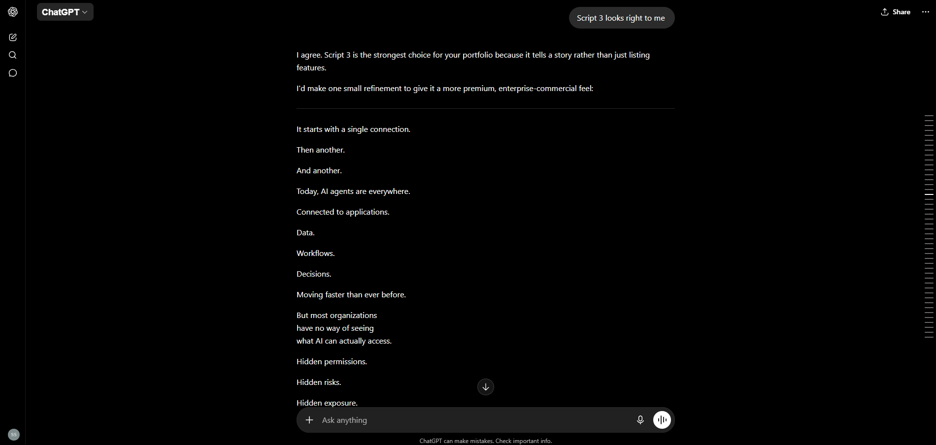
After thoroughly understanding Reco's mission and vision, I gathered the relevant information and worked through several iterations with ChatGPT to explore different script directions. The objective was to create a simple, easy-to-understand narrative that clearly explains what Reco is, the problem it solves, and how it helps users.
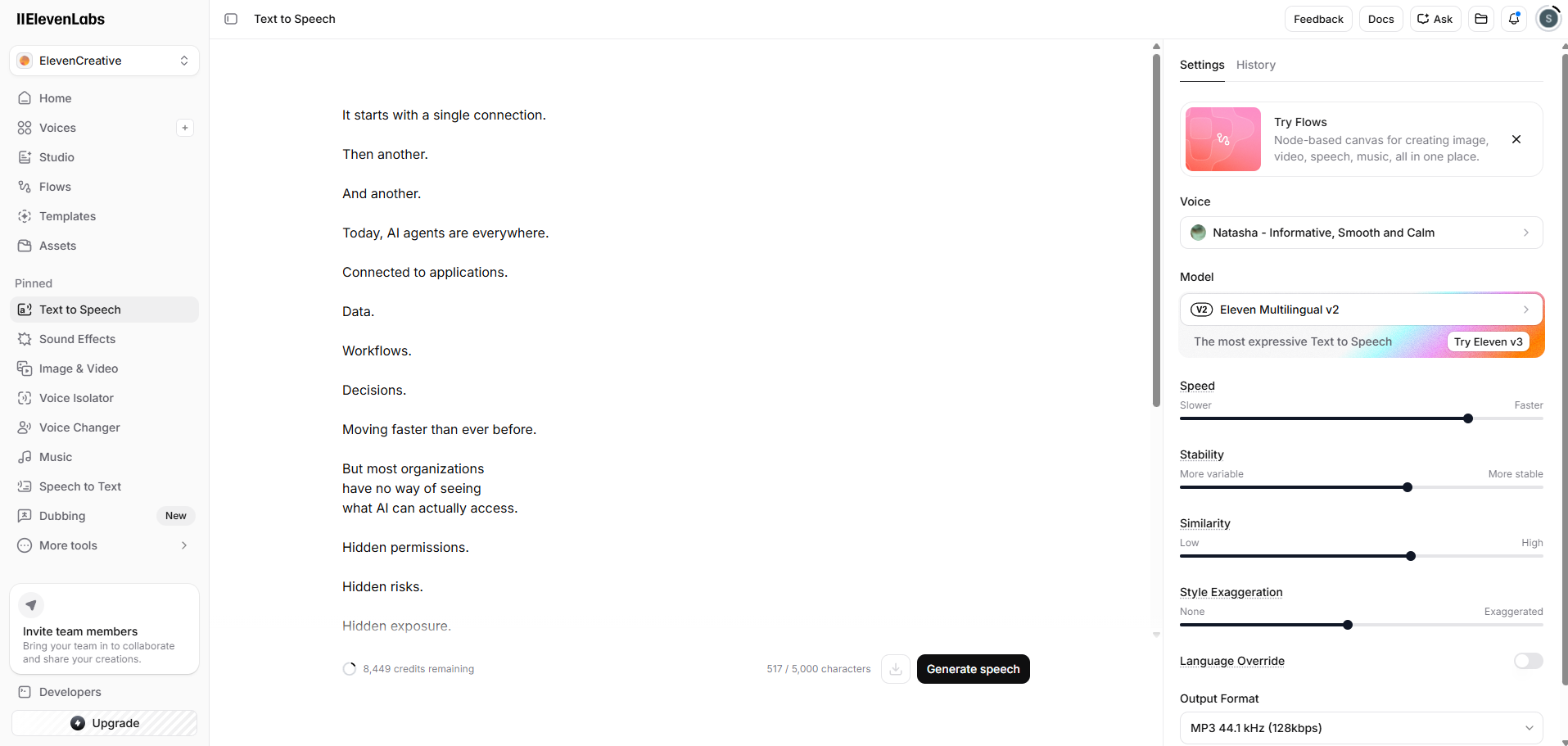
For the voice-over, I used ElevenLabs, which I consider one of the most capable AI voice generation tools currently available. The primary challenge was selecting a voice that felt confident, clear, and trustworthy from the many available options. I specifically looked for a female voice that sounded youthful while still carrying enough depth and authority to complement the brand.
Once the voice was selected, the next challenge was refining the pacing, speed, and delivery. This involved multiple iterations to ensure the narration felt natural, engaging, and as close to a professionally recorded human voice-over as possible.
Scene Development
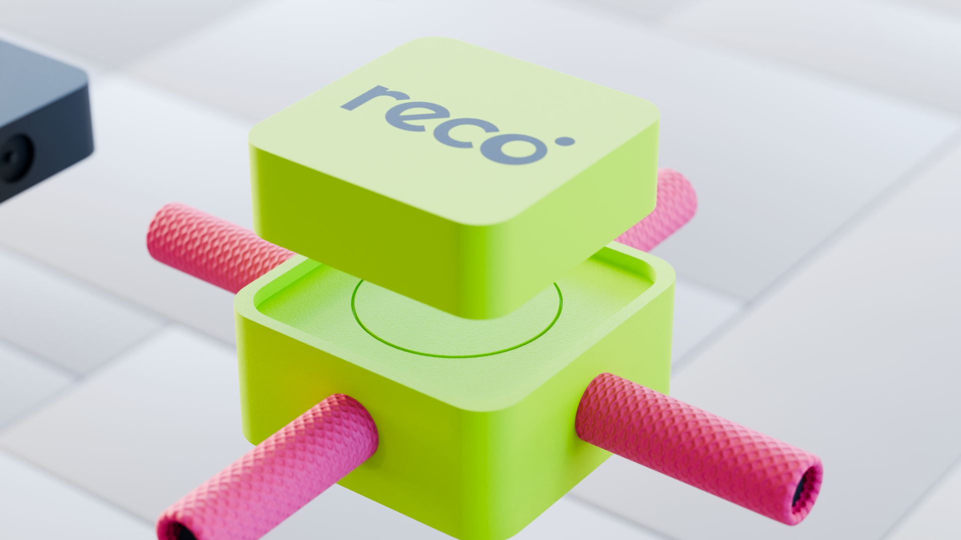
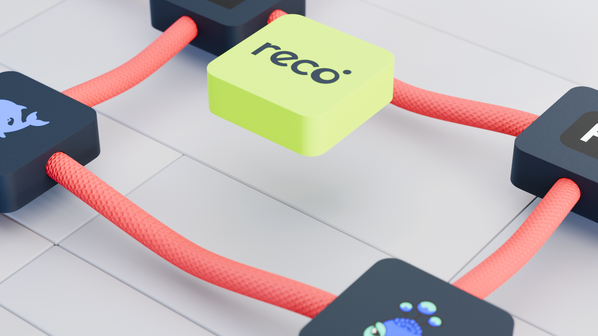
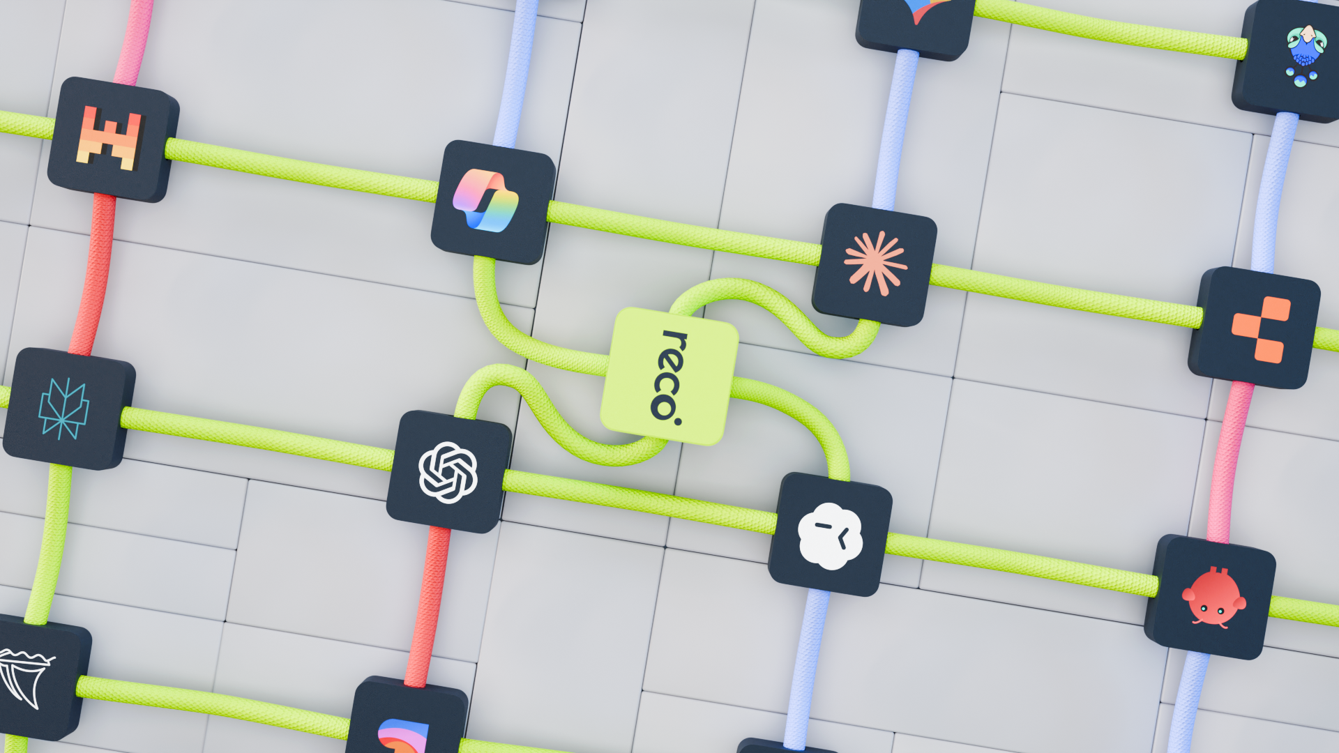
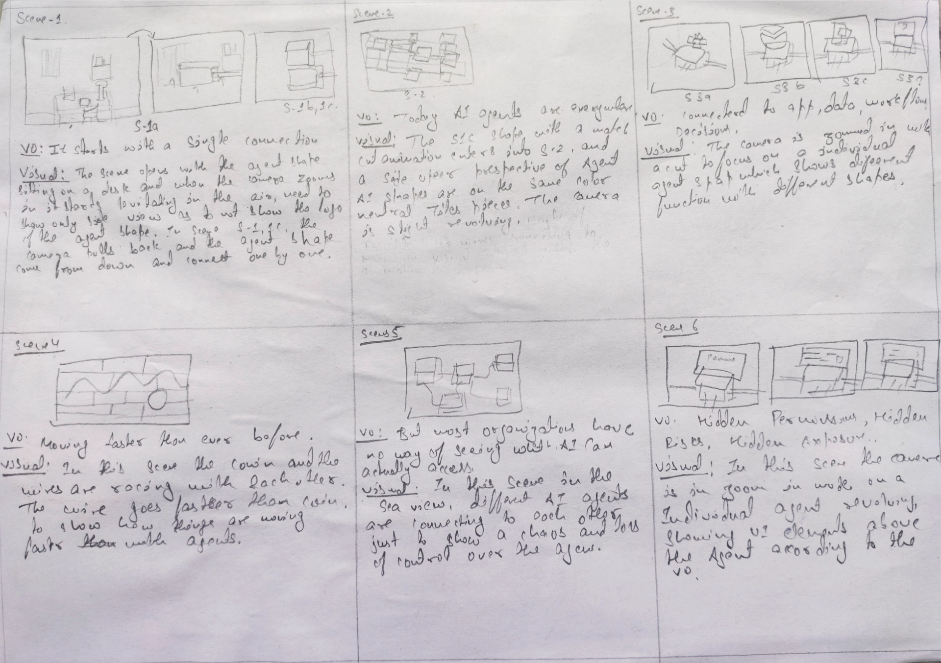
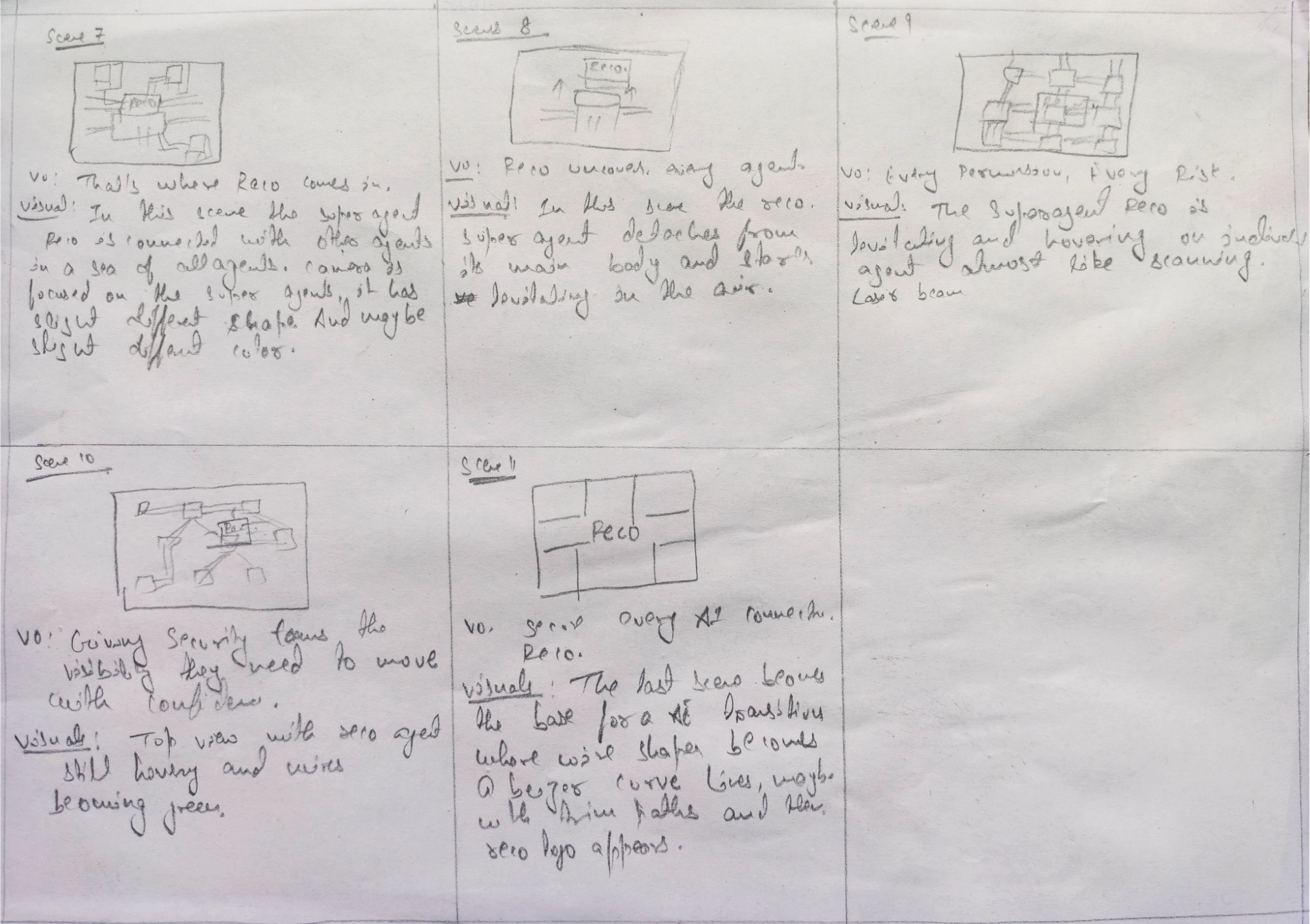
After reading the script, I began visualizing Reco as an "agent of agents" , a central intelligence that connects and orchestrates multiple AI agents. This concept became the foundation for the visual direction of the project.
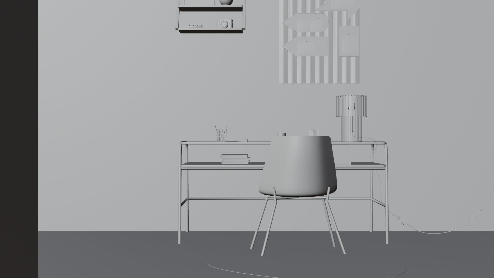
To represent the different AI agents, I chose simple cuboid forms. Reco itself is distinguished using the brand's primary color green while the supporting agents are represented with Navy blue. I wanted the forms to feel approachable rather than overly technical, so I designed them with soft, rounded edges. The inspiration for this rounded cuboid shape came from the clean, minimal industrial design of the Mac mini.
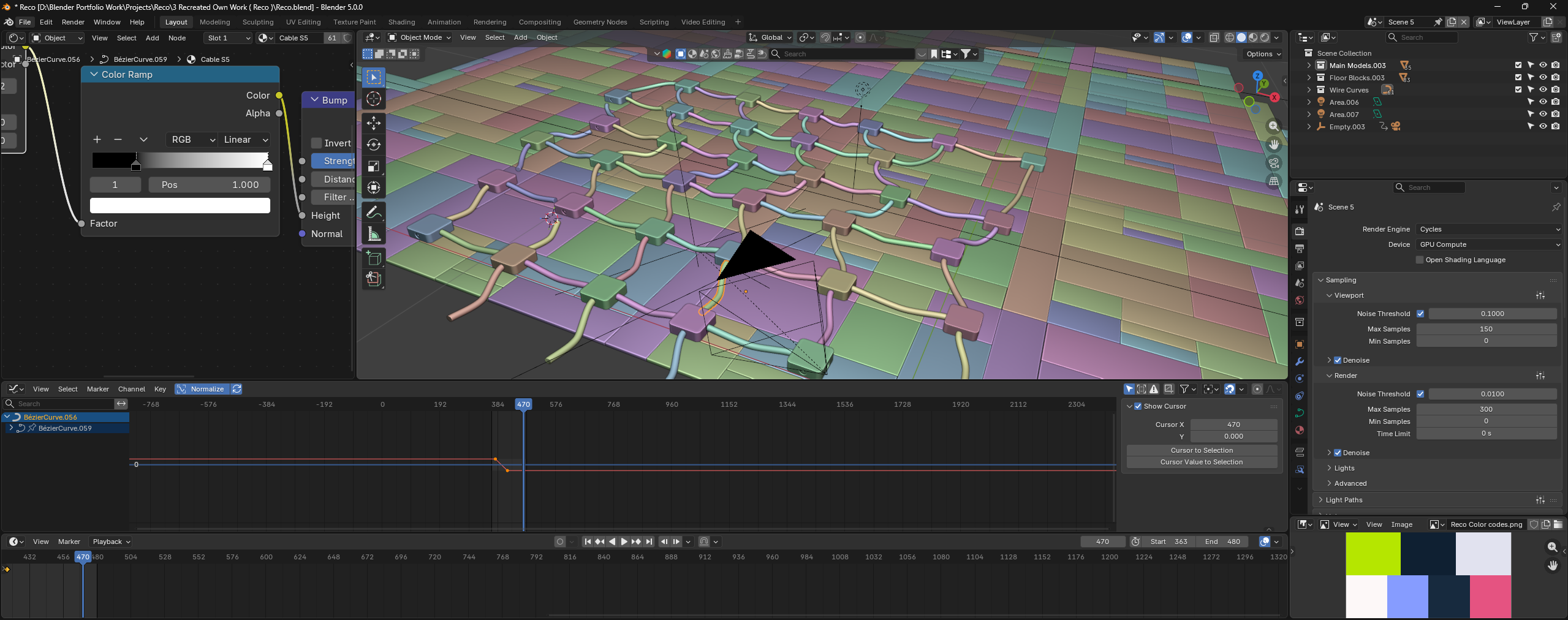
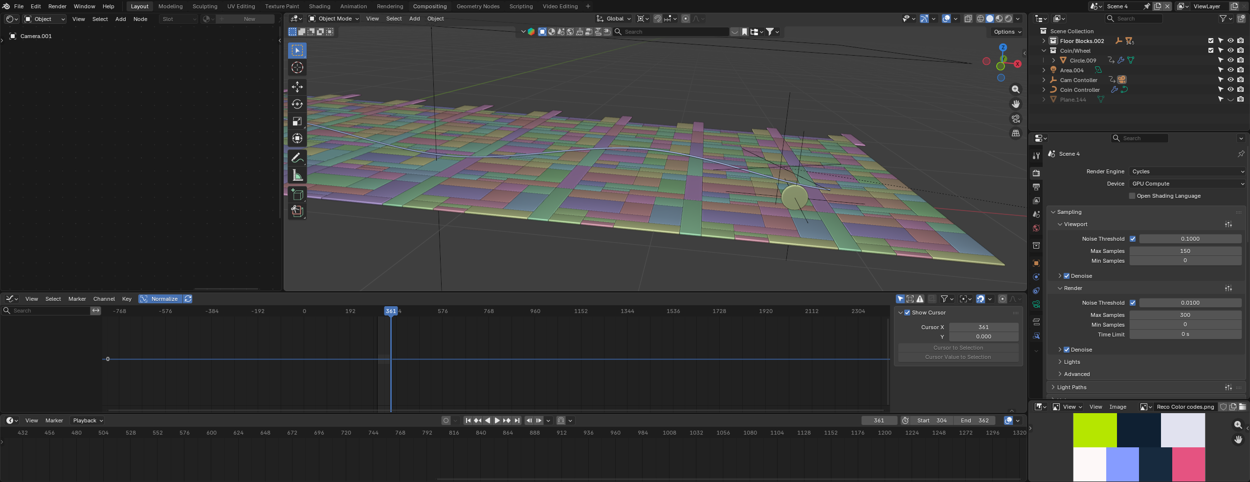
I imagined these individual agent modules communicating through connecting wires, creating a network that visually reinforces the idea of collaboration. Every connection ultimately leads back to the central "super agent" which is Reco, highlighting its role as the intelligent hub that coordinates and unifies the entire ecosystem of AI agents.
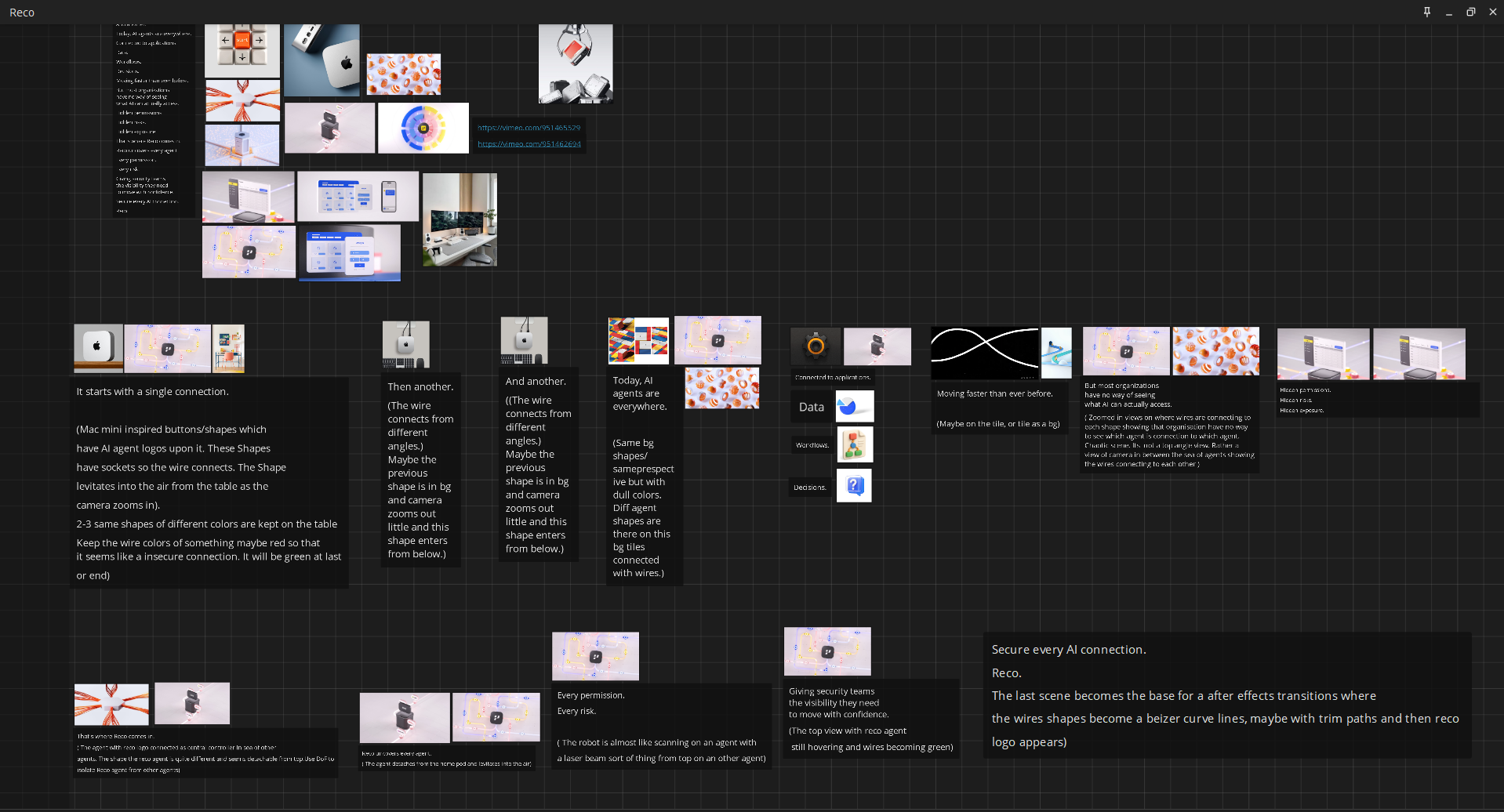
Clay Model


BTS - Behind the scenes
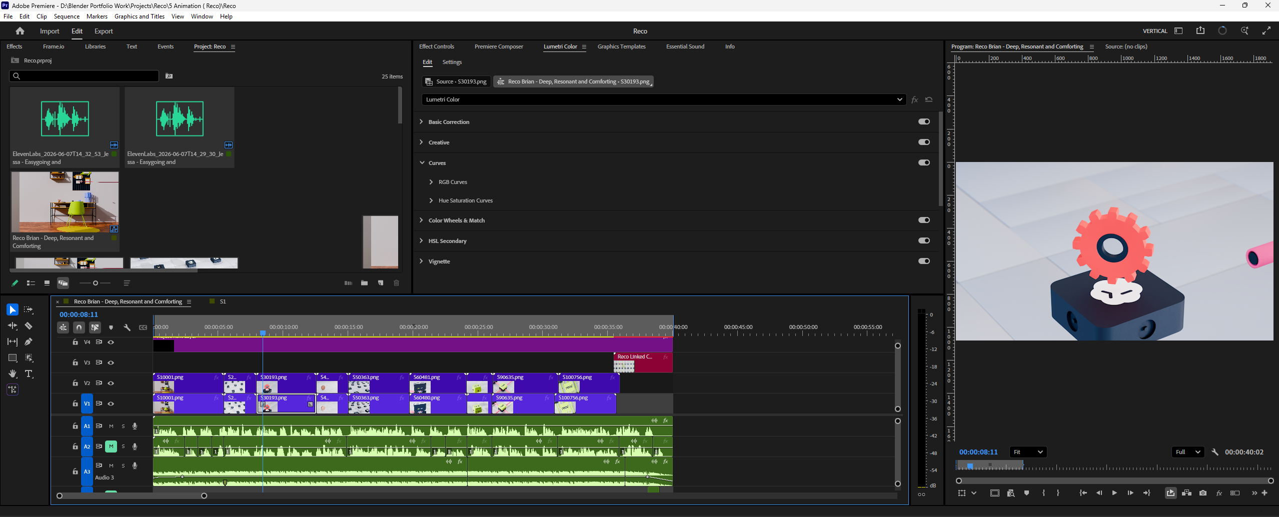
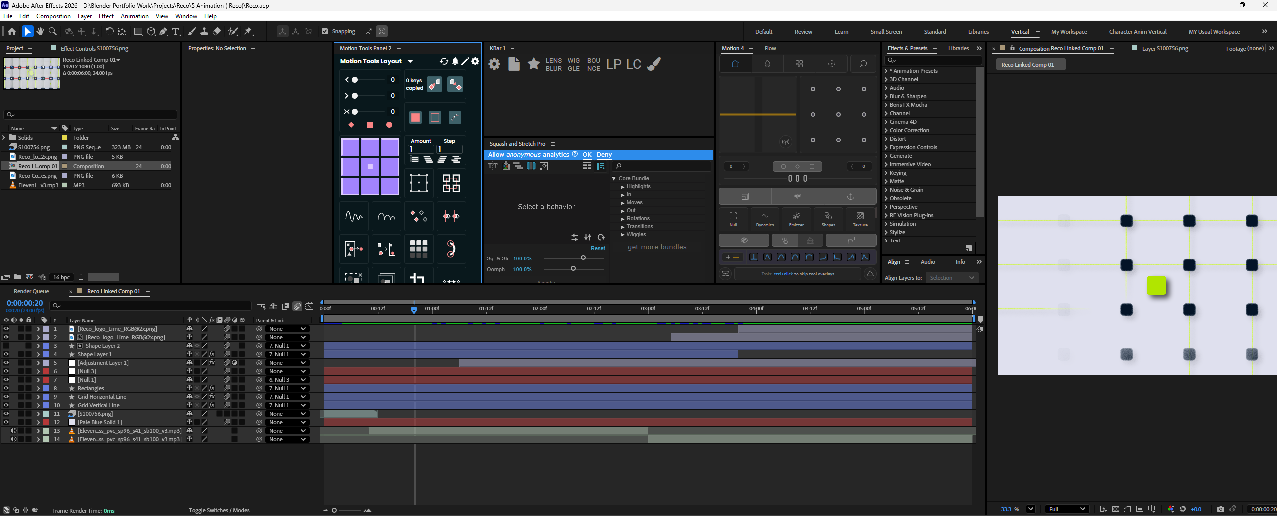
Though most of the work has been done is Blender itself, I used Adobe after effects for End scene of Reco logo animation and Adobe Premiere Pro for compositing all scenes and sound design.
For color correction and other asset preparation, i have used affinity designer.
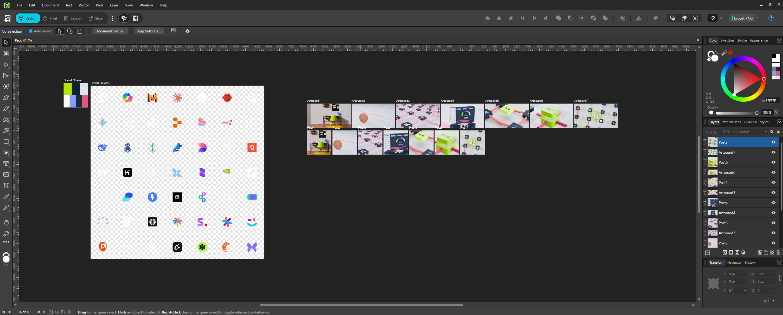
Tools Used:


